
Color plays a vital role in art therapy, serving as a powerful tool to influence our feelings and facilitate creative expression. By understanding how different colors can evoke emotions, therapists and clients alike can harness their potential to foster emotional insight and healing. Recognizing the nuanced ways that color impacts mood allows for more intentional choices during art therapy sessions, helping individuals access and process complex emotions through visual means. In this blog, we will explore the significance of color within the context of art therapy, emphasizing how selecting appropriate hues can deepen emotional exploration and promote self-awareness.
Understanding the Psychology of Color
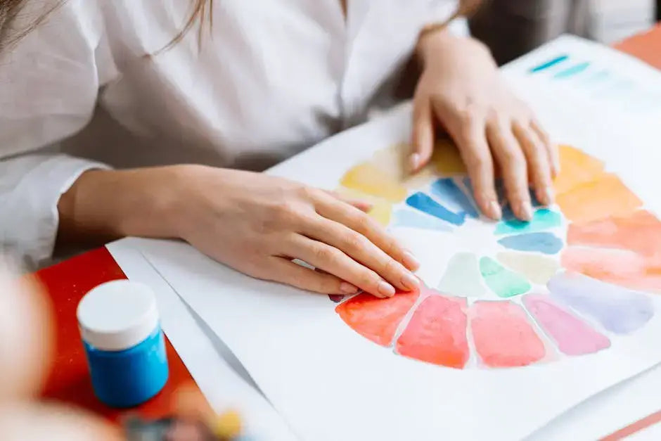
Colors possess a profound ability to evoke specific emotional responses, rooted in both biological and cultural factors. In art therapy, a thorough grasp of the psychology of color enables practitioners to guide clients toward expressive choices that resonate deeply with their internal states. Different cultures interpret colors uniquely, which adds a layer of complexity and richness to their application. For example, while red often symbolizes passion or anger in Western contexts, it may represent good luck or celebration in other cultures. This cultural perspective enhances our understanding of how color choices can be tailored to individual backgrounds, making therapy more personalized and effective.
Exploring how colors influence mood reveals that many associations are formed through personal experiences, societal messages, and cultural norms. For instance, blue is frequently linked to calmness and serenity but can also evoke feelings of sadness or melancholy. Recognizing these associations helps therapists and clients use color intentionally to unlock subconscious emotions that may surface during creative processes. This intentional use of color can facilitate a deeper connection to one's emotional spectrum, allowing for more meaningful self-expression and insight.
Understanding the psychological impact of color not only informs palette selection but also enhances the therapeutic process by enabling individuals to consciously explore and process their feelings. This awareness can lead to breakthroughs in emotional regulation, resilience, and self-understanding, making art therapy sessions more impactful and transformative.
The Emotional Spectrum of Colors
Each hue within the emotional spectrum symbolizes distinct feelings and states of mind, offering a palette for emotional exploration and regulation. For example, blue often embodies tranquility and can help calm anxiety, while red signifies passion and intensity, providing an outlet for expressing strong emotions. Yellow is frequently associated with happiness and optimism, serving as a visual affirmation of hope. By understanding these connections, clients can intentionally select colors that mirror or influence their emotional states, facilitating a process of catharsis and self-discovery.
Colors like green, which represent healing and renewal, are particularly beneficial for those seeking emotional rebirth or recovery. Conversely, shades of gray may reflect ambiguity, confusion, or sadness but can function as neutral backgrounds that highlight more vibrant colors, emphasizing hope or clarity when layered appropriately. This nuanced understanding of the emotional spectrum allows for more deliberate and effective use of color in art therapy, encouraging clients to craft visual narratives that reflect their inner worlds with authenticity.
Engaging with the emotional spectrum through color choices enables individuals to develop a deeper awareness of their internal landscape. Small adjustments in color selection can significantly alter the meaning of an artwork, transforming it into a powerful therapeutic tool. Reflecting on personal emotional responses to different hues can reveal underlying feelings and patterns, providing valuable insights during the healing process.
Choosing Colors for Different Emotional States
In art therapy, deliberate color selection tailored to current emotional states can enhance expressive capacity and promote emotional regulation. When feeling overwhelmed by anxiety, soft blues and calming greens can foster a sense of peace and safety, creating a soothing environment for self-reflection. Conversely, vibrant oranges and yellows can serve as outlets for expressing excitement or exuberance, helping to channel energy constructively. Recognizing the connection between mood and color choice empowers clients to use art as a form of emotional self-regulation and release.
This strategic approach to color selection encourages individuals to move beyond instinctual choices toward more intentional expression. Keeping a color journal—documenting moods alongside favored hues—can deepen self-awareness and reveal patterns that might otherwise go unnoticed. Such practices help clients understand how different colors influence their emotional states and can serve as a guide for future art therapy sessions, fostering ongoing growth and insight.
By aligning color choices with emotional needs, clients can create artwork that acts as a mirror to their feelings, facilitating catharsis and clarity. This process supports the development of emotional resilience and offers a visual language for complex internal experiences, making art therapy sessions more meaningful and transformative.
Techniques for Incorporating Color in Art Therapy
Effective use of color in art therapy extends beyond palette selection to include techniques such as blending, layering, and contrasting, each serving to deepen emotional expression. Color blending allows for smooth transitions between hues, symbolizing the fluidity of emotions and the interconnectedness of feelings. For example, a gradient from red to blue can represent a journey from passion to calm, illustrating emotional shifts that may be difficult to articulate verbally.
Layering colors adds depth and complexity to artwork, reflecting the multifaceted nature of human experience. Multiple layers can evoke feelings of layered memories, conflicting emotions, or evolving perspectives, making the artwork a rich canvas for exploration. Contrasting colors can also highlight specific emotional themes or create visual tension, prompting viewers and creators to examine underlying feelings more closely.
These techniques not only enhance aesthetic quality but also serve as powerful tools for emotional processing. They enable clients to experiment with expressing nuanced or conflicting feelings within a safe, controlled environment. Through intentional manipulation of color, individuals can explore emotional boundaries, foster resilience, and gain new insights into their internal worlds.
Case Studies: Transformative Art Therapy Sessions
Real-life examples illustrate how purposeful color choices can serve as catalysts for emotional transformation. In one case, a woman dealing with grief used dark hues like black, gray, and deep blue to express her sorrow. Over the course of several sessions, her palette gradually shifted toward brighter oranges and yellows, symbolizing hope and healing. This visual progression mirrored her emotional journey, demonstrating how art can facilitate a gradual release of pain and foster resilience.
Another compelling example involves a group therapy setting where participants were encouraged to depict their feelings about a shared event. Those who employed vibrant colors reported feeling more connected and optimistic, highlighting the role of color in enhancing group cohesion and collective emotional processing. Such stories underscore the therapeutic potential of intentional color use, showing how visual choices can unlock deeper layers of emotion and promote collective healing.
These case studies exemplify how deliberate color application in art therapy can serve as a powerful means of emotional release, insight, and transformation. They encourage both practitioners and clients to view color as a vital part of the therapeutic process—one that can unlock hidden feelings, foster resilience, and support personal growth.
Embracing Colors in Your Art Therapy Journey
Incorporating thoughtful color choices into art therapy can significantly enhance emotional expression and facilitate healing. By consciously engaging with the emotional spectrum that different colors evoke, individuals can deepen their self-awareness and foster meaningful connections with their feelings. The process of selecting and working with colors becomes a personal dialogue—one that encourages exploration, acceptance, and growth. Remember, there are no right or wrong colors; what matters most is what resonates with you on a visceral level, allowing your artwork to serve as a true reflection of your internal experience.